

-
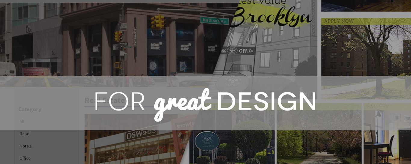
Flatbush Gardens
Flatbush Gardens already had an existing logo, so we selected pastel colors for the website to match it. We used predominantly green colors to emphasize the “gardens” aspect of the company. The concept was for the creation of a “fresh, bright, open space”, hence the aptly placed breathing spaces within the layout.
-
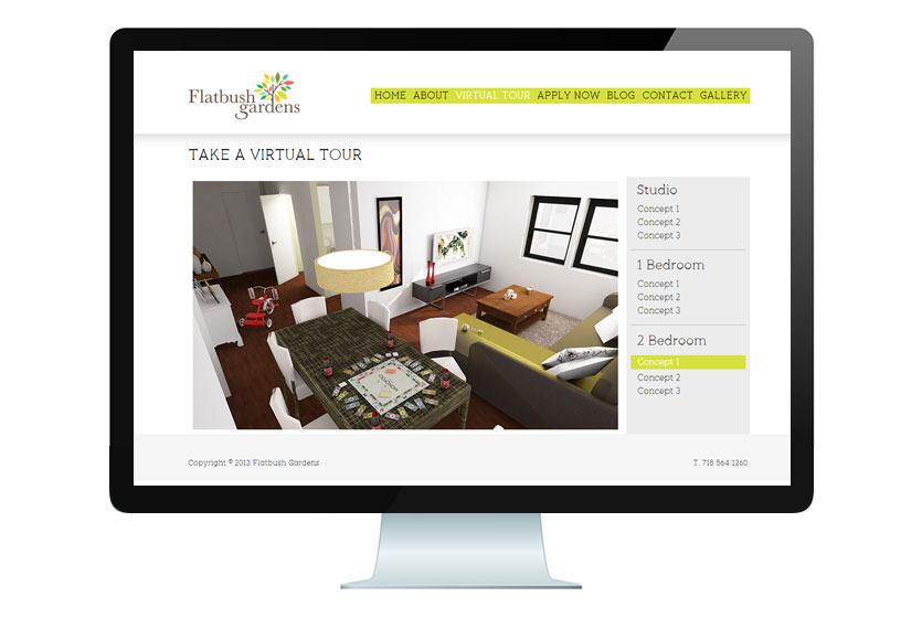
Flatbush Gardens
Flatbush Gardens already had an existing logo, so we selected pastel colors for the website to match it. We used predominantly green colors to emphasize the “gardens” aspect of the company. The concept was for the creation of a “fresh, bright, open space”, hence the aptly placed breathing spaces within the layout.
-
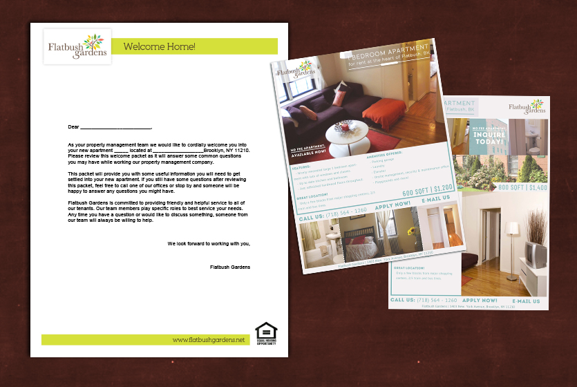
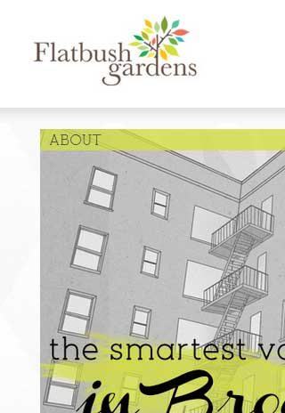
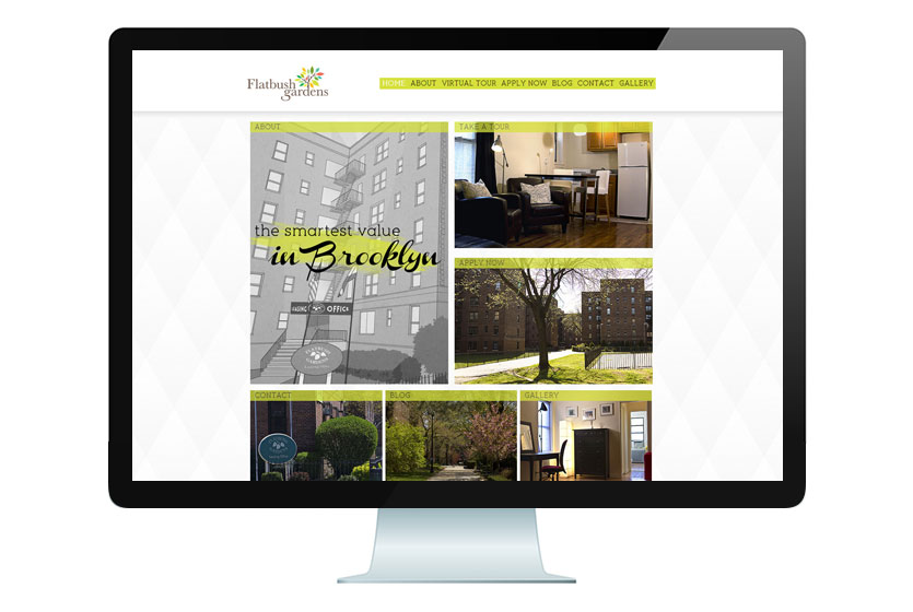
Flatbush Gardens
The Flatbush Gardens needed many documents designed, from their simple welcome packet (left) to their Craigslist ads (right). We wanted to make the ads stand out from the other ads on Craigslist, so we chose bright, eye-catching colors that would match well with the logo. In addition, we made use of good layouts and an understandable flow of images and information.
-
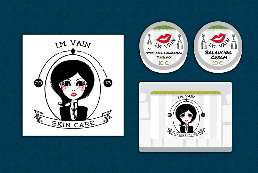
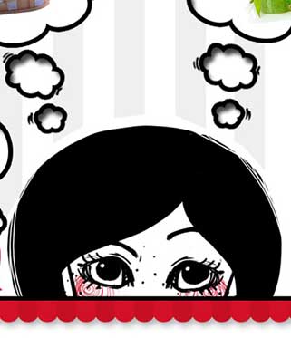
IM Vain
I.M. Vain is a dermatological care company which mainly targets women. Their vibe is a dark but playful feel which is projected in this logo. We also placed the character in a frame to emphasize how I.M. Vain gives importance to beauty and healthcare. The packaging designs extend the playful feel by incorporating the logo in such a way that it looks like the character is in a room or hallway.
-
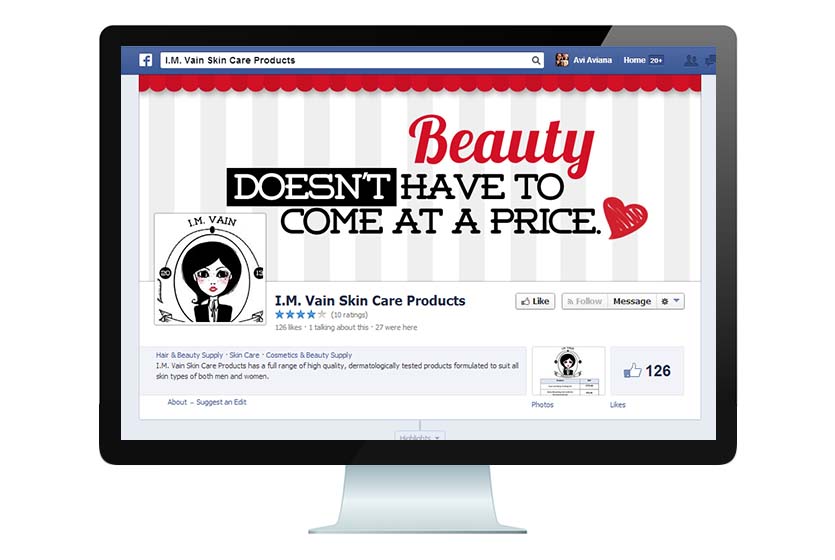
IM Vain
The I.M. Vain Facebook cover photo meshes cohesively with the website and other branding elements by using pale stripes and red accents.
-
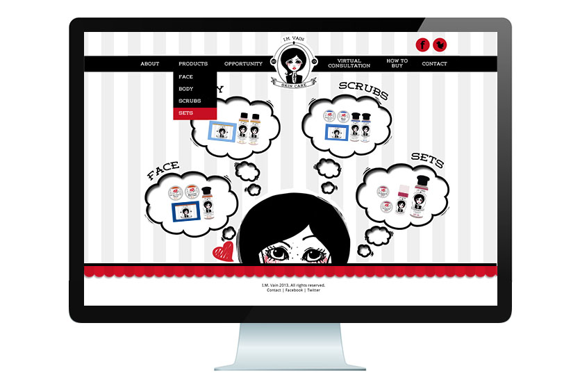
IM Vain
I.M. Vain didn't want to be just another beauty product site, so we created a more playful website to match the feel of the logo.
-
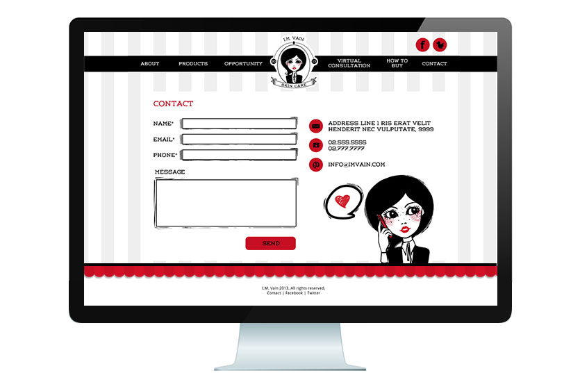
IM Vain
I.M. Vain didn't want to be just another beauty product site, so we created a more playful website to match the feel of the logo.
-
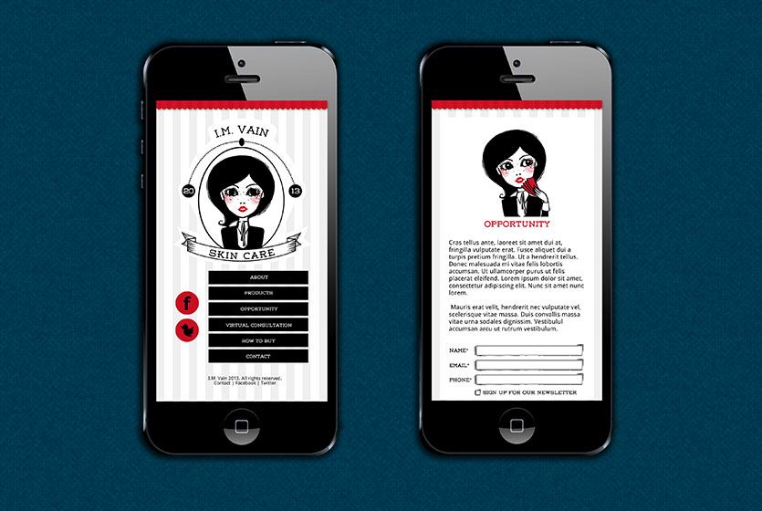
IM Vain
I.M. Vain didn't want to be just another beauty product site, so we created a more playful website to match the feel of the logo.
-
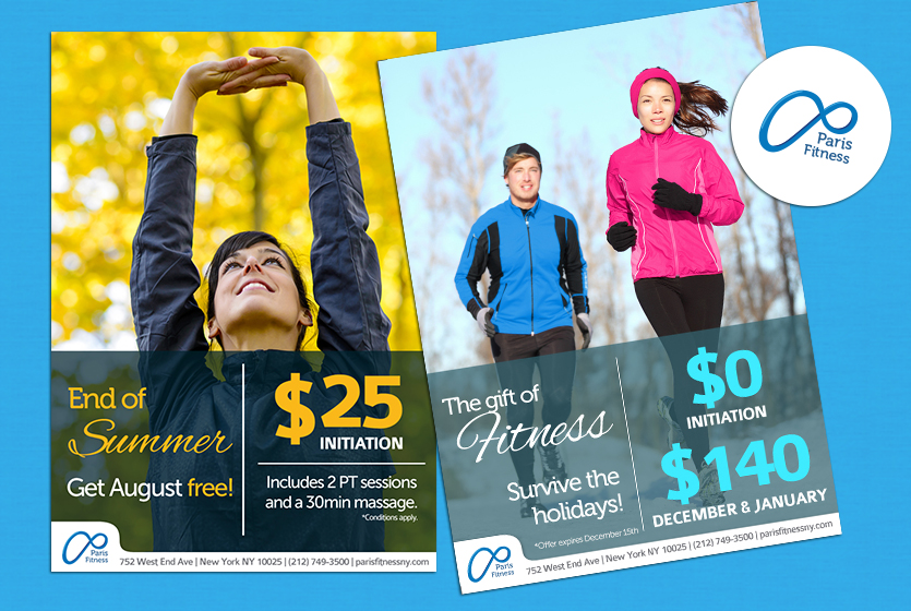
Paris Fitness
Paris Fitness is a health club and gym in the Upper West Side area of New York. They've been established in that area for a very long period of time, so it felt appropriate to incorporate an ornate P and the symbol for infinity into their logo, alluding to their long experience in the fitness industry and impeccable service. Each month, Paris needs new promotional items, so we tie each of the designs together by making use of text on semi-transparent backgrounds and the tabbed footer.
-
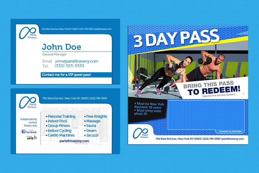
Paris Fitness
The tabbed footer also appears on their business cards, special passes, and website. That footer and the watery blues that dominate the designs are what gives Paris Fitness its distinct identity.
-
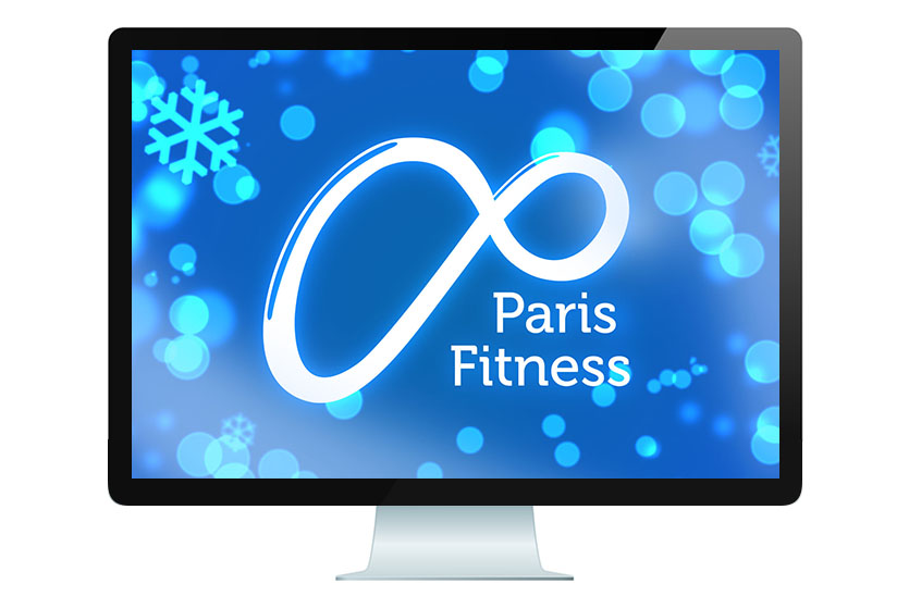
Paris Fitness
Maddington also made seasonal screensavers for the televisions and computers in the Paris Fitness gym. The Dreamy Winter screensaver is shown here.
-
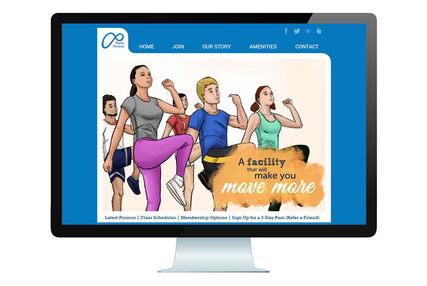
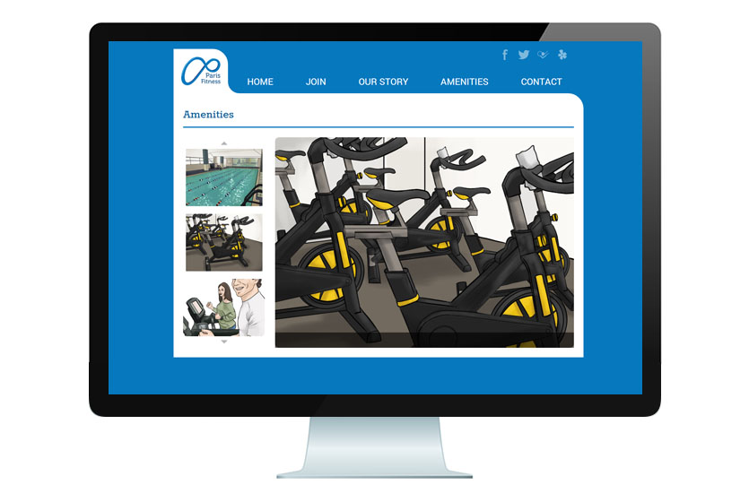
Paris Fitness
The Paris Fitness website sets itself apart from other fitness websites by using colored illustrations instead of photos. Everything from their classes to their indoor swimming pool was drawn and colored digitally by the Maddington artists.
-
Paris Fitness
The Paris Fitness website sets itself apart from other fitness websites by using colored illustrations instead of photos. Everything from their classes to their indoor swimming pool was drawn and colored digitally by the Maddington artists.
-
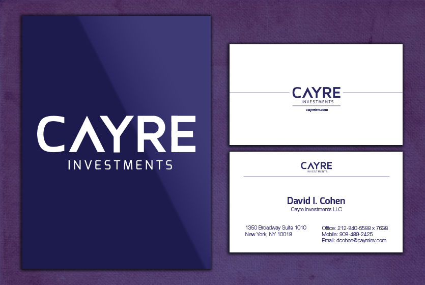
Cayre
Cayre Investments, with its vast portfolio of properties, can be considered as a member of the United States' real estate royalty. Hence, the logo we created for them features a rich purple. It is starkly contrasted by pure white, which is the color of cleanliness and fairness. View the site here
-
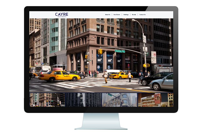
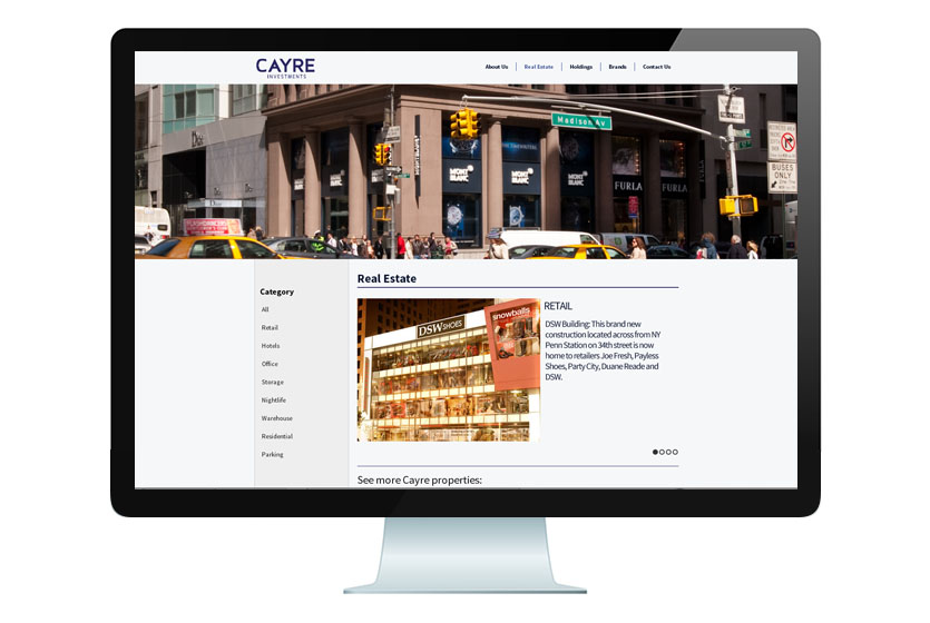
Cayre
Cayre Investments favored a sharp, angled website, which projects a serious, no-nonsense air. The main attraction of the site is the use of large photos that fill the screen to showcase their various properties. View the site here
-
Cayre
Cayre Investments favored a sharp, angled website, which projects a serious, no-nonsense air. The main attraction of the site is the use of large photos that fill the screen to showcase their various properties. View the site here
-
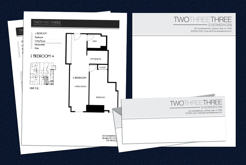
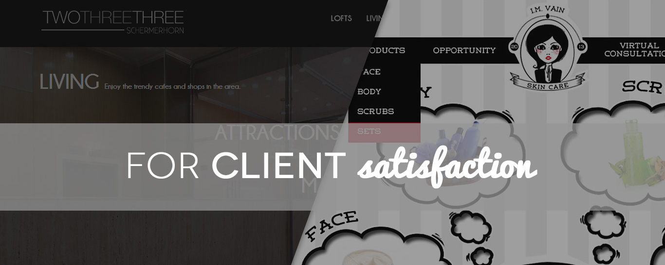
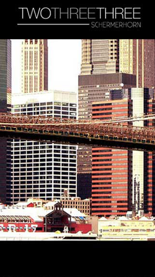
233 Schermerhorn
233 Schermerhorn was meant to be simple and classy. The dark colors and straight lines of the logo lent it an air of sophistication. The sell sheets, letterheads and envelopes were also designed around the neutral colors to stay cohesive with the look and feel of the company. In addition, the sell sheets have a highly straightforward design that puts all focus on them.
-
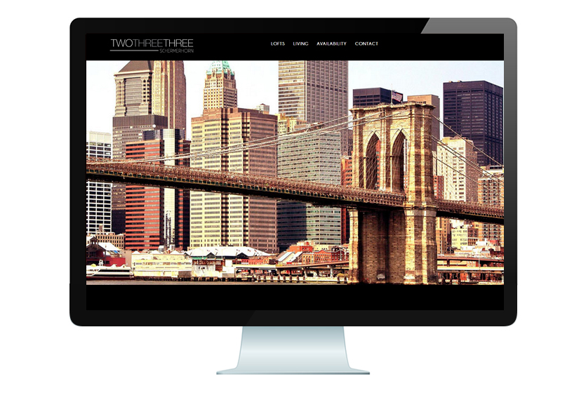
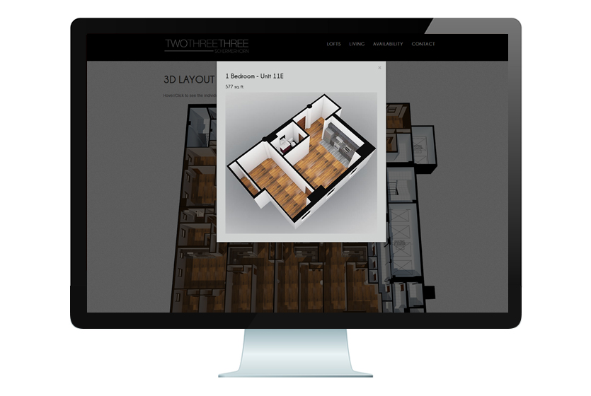
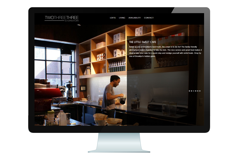
233 Schermerhorn
The concept for the Schermerhorn site was “sleek and modern”. Black backgrounds served to help the beautiful photos and 3D models Maddington created to stand out.
-
233 Schermerhorn
The concept for the Schermerhorn site was “sleek and modern”. Black backgrounds served to help the beautiful photos and 3D models Maddington created to stand out.
-
233 Schermerhorn
The concept for the Schermerhorn site was “sleek and modern”. Black backgrounds served to help the beautiful photos and 3D models Maddington created to stand out.
-
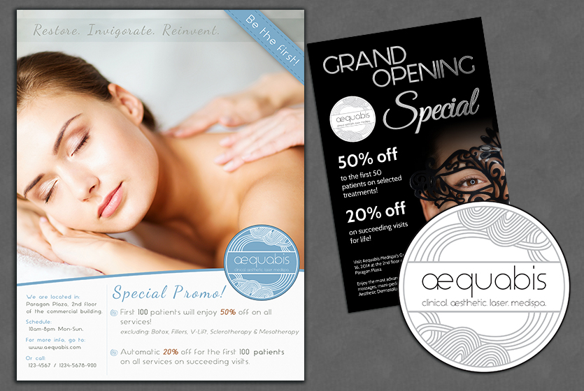
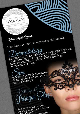
Aequabis
Aequabis Medispa is a luxury medispa in the bustling city of Mandaluyong. They wanted to project the idea that they were the go-to place for the elite in their branding. The name Aequabis was the Latin word for smooth; thus, the use of rounded edges, solid colors, and flowing lines is predominant in the logo and marketing materials we created for them. We consistently used a single large photo so as to not clutter the page.
-
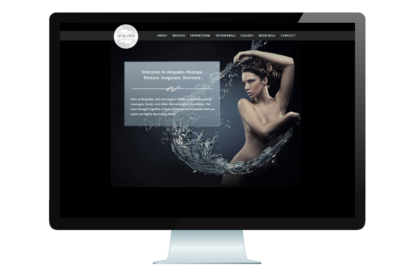
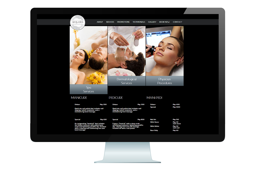
Aequabis
The Aequabis website is an elegant one-page scrolling site with some animations and transitions to add interest. We struck a balance between informative text and beautiful imagery. View the site here
-
Aequabis
The Aequabis website is an elegant one-page scrolling site with some animations and transitions to add interest. We struck a balance between informative text and beautiful imagery. View the site here
-
Aequabis
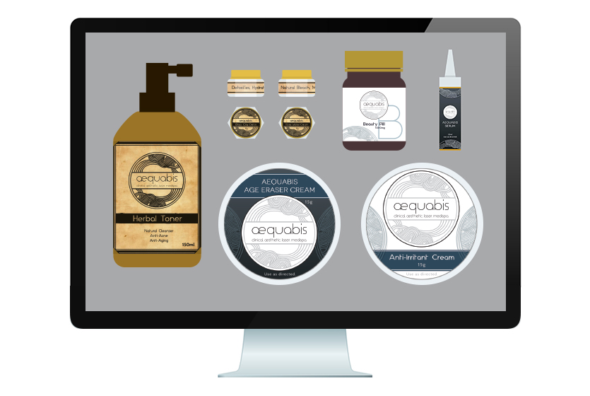
Aequabis products came in three sets: the regular products, the Special Edition Aequabis labels, and the apothecary items.
-
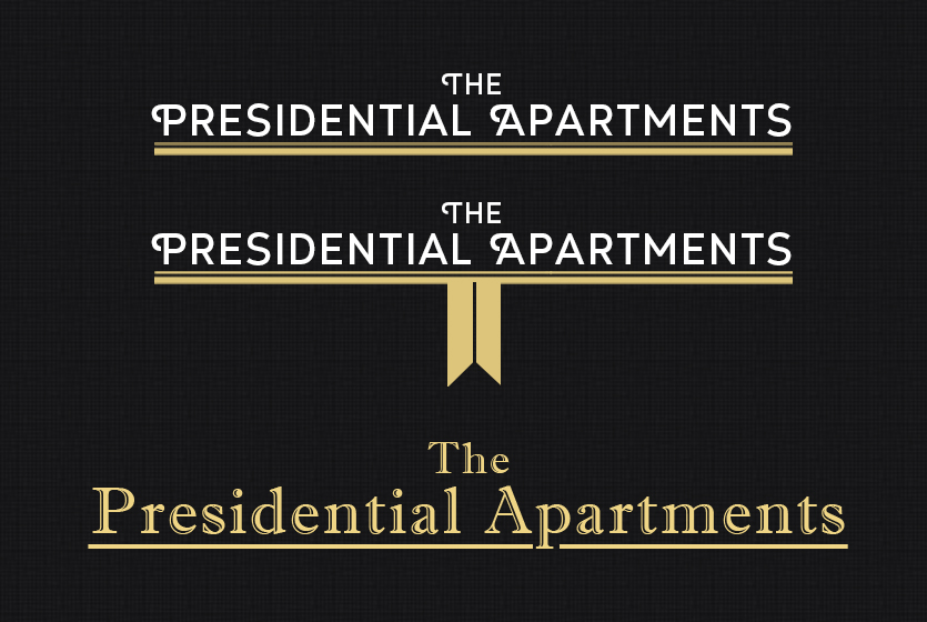
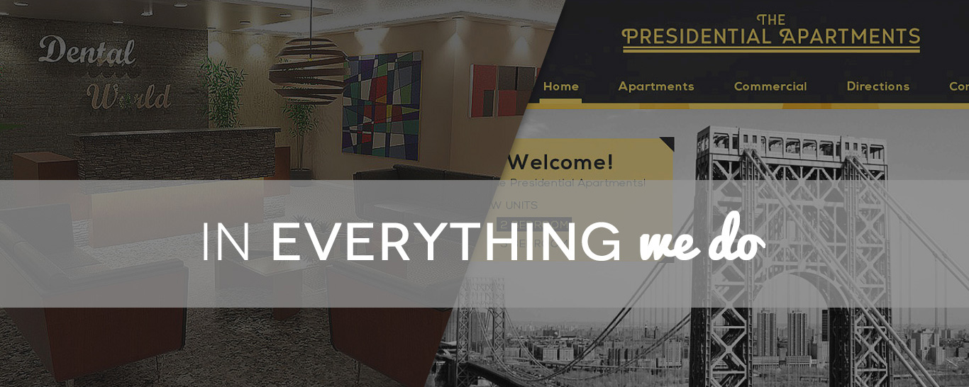
Presidential Apartments
The Presidential Apartments is a vintage residential and commercial complex in New Jersey. Keeping with its identity, we crafted a simple, classy logo, colored gold to make it more distinguished.
-
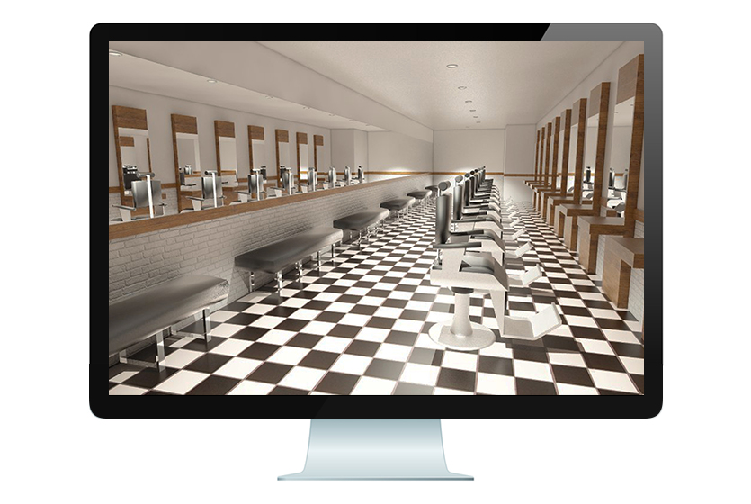
Presidential Apartments
To aid in the marketing efforts of The Presidential Apartments, Maddington created 3D models to show how commercial units at the complex could look when spruced up with various tenants.
-
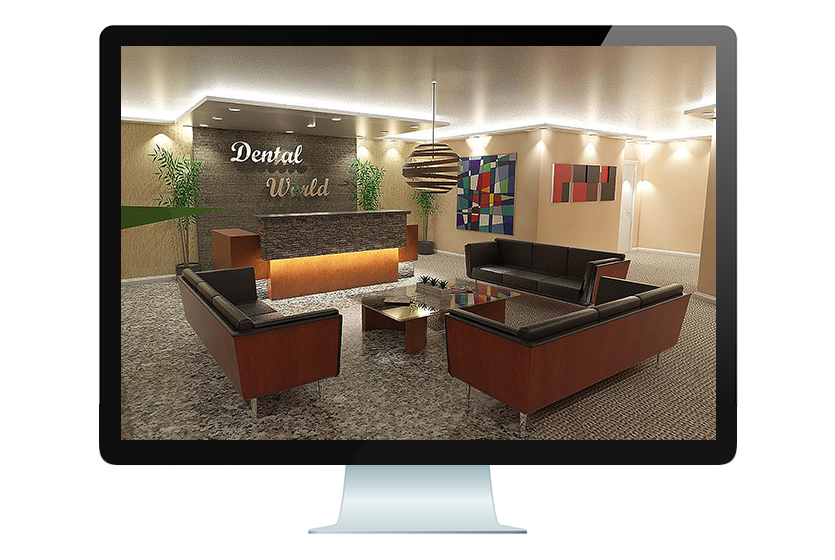
Presidential Apartments
To aid in the marketing efforts of The Presidential Apartments, Maddington created 3D models to show how commercial units at the complex could look when spruced up with various tenants.
-
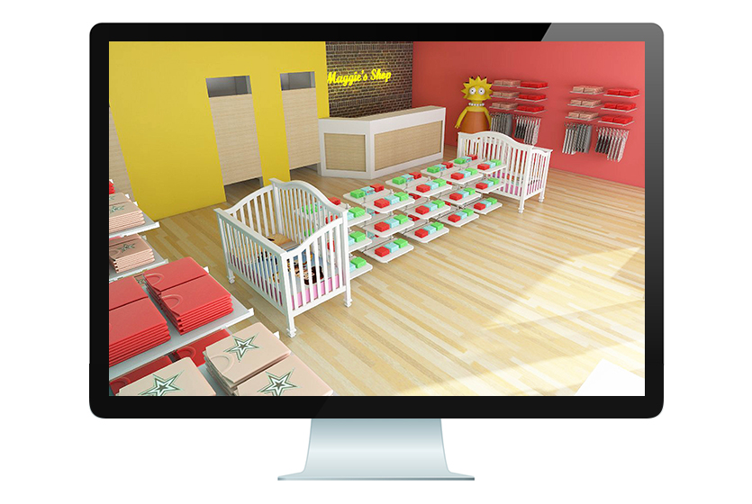
Presidential Apartments
To aid in the marketing efforts of The Presidential Apartments, Maddington created 3D models to show how commercial units at the complex could look when spruced up with various tenants.
-
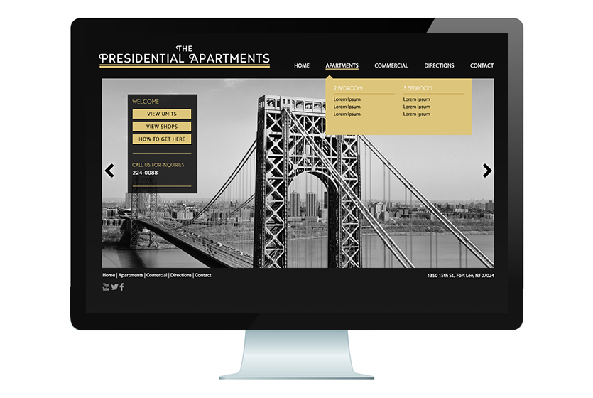
Presidential Apartments
We used a black and gold color scheme for the website to create a luxurious feel to fit its name. The concept behind the website was to project the area as a very classy and established setting.
-
-
Bala 8Hour
Bala 8Hour markets itself as a healthy energy shot. Their branding is predominantly flame-colored – invoking thoughts of heat, action, and speed. This display box was created as a promotional item to be displayed in motels.
-
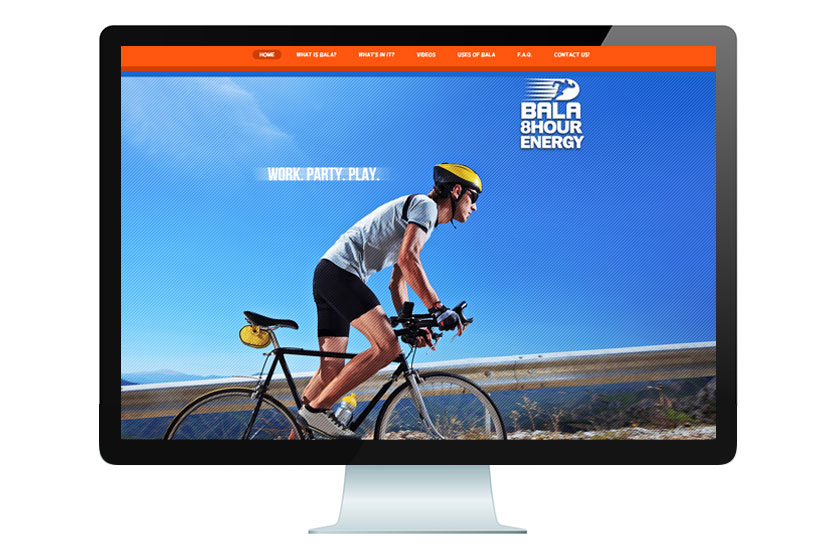
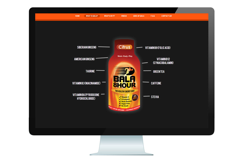
Bala 8Hour
The Bala 8Hour website is predominantly dark gray with a carbon fiber texture and orange accents to invoke serious undertones. The Maddington designers also illustrated comics and incorporated them into the website to show the many uses and benefits of Bala.
-
Bala 8Hour
The Bala 8Hour website is predominantly dark gray with a carbon fiber texture and orange accents to invoke serious undertones. The Maddington designers also illustrated comics and incorporated them into the website to show the many uses and benefits of Bala.
-
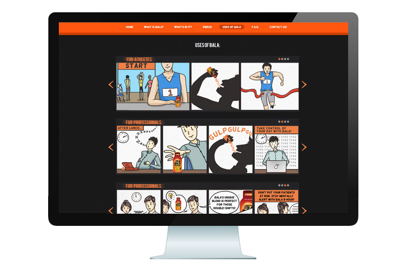
Bala 8Hour
The Bala 8Hour website is predominantly dark gray with a carbon fiber texture and orange accents to invoke serious undertones. The Maddington designers also illustrated comics and incorporated them into the website to show the many uses and benefits of Bala.
-
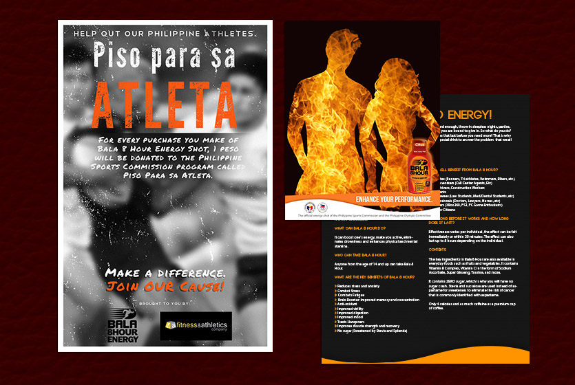
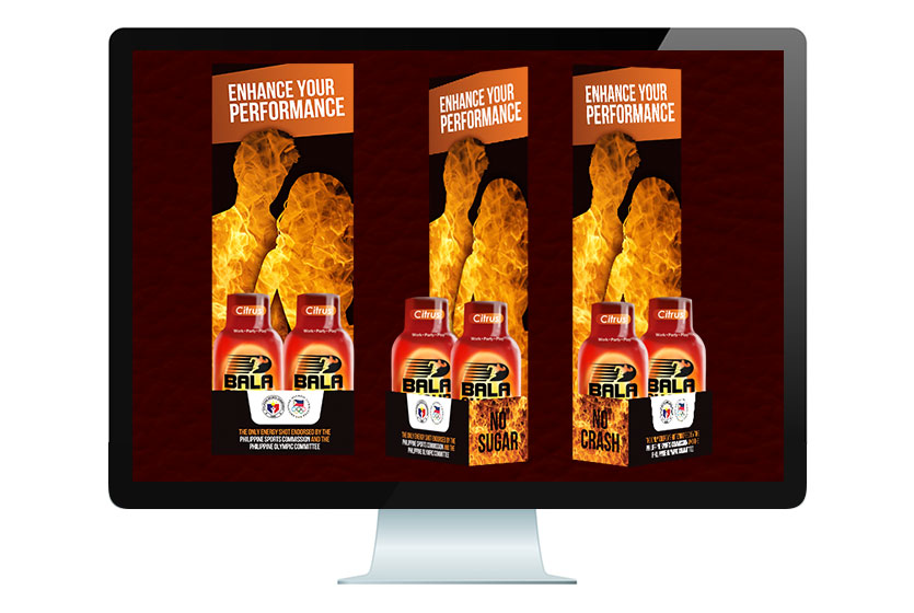
Bala 8Hour
We still kept with the black, gray, and orange color scheme for the marketing items. We made use of large, attention-catching photos and edited them to add interest. We used orange letters or backgrounds to highlight important parts of the poster.
-
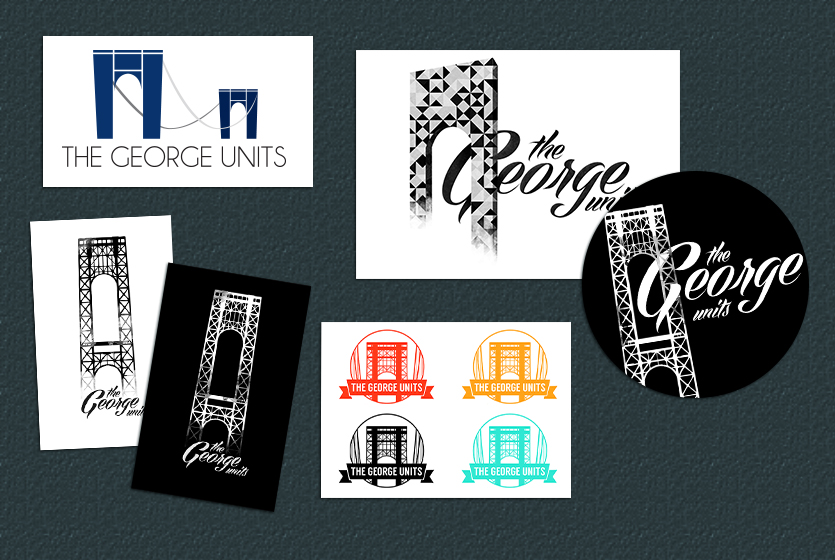
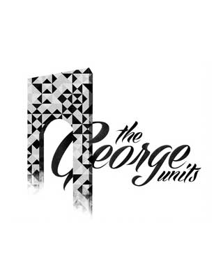
George Units
For this logo project, we rendered different perspectives of the George Washington bridge. The abstract studies gave off a more modern feel, from the perspective of a tenant looking from the window of George Units. The brightly-colored studies meant a quirky welcome, seen from the perspective of someone driving on the bridge towards the city. The black and white studies paid homage to the classic and impressive structure of the bridge.
-
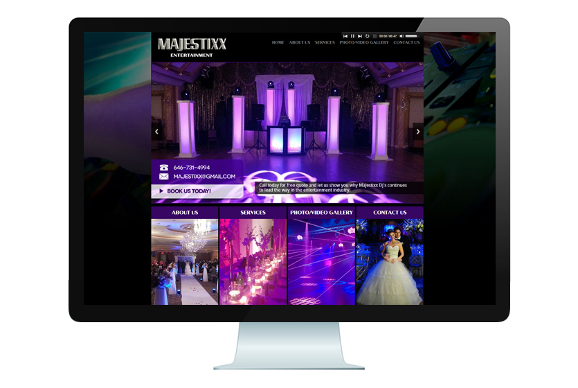
Majestixx
Majestixx Entertainment is a trusted DJ and entertainment company based in New York. We created a website with a black and purple color scheme to allude partying all night. The Majestixx website showcases its event photography and videography within the sections of their website.